Sunday 23 August 2015

Mixed Media Creative Gym Exercise #11: Rusted & Rustical

Okay so I'm slightly obsessed about learning all I can about mixed media (along many other obsessions in the industry). So I'm currently following the challenges over at Mixed Media Place because I really want to learn more and extend what I already know about creating with mixed media. The designers over at Mixed Media Place are so talented and innovative.

The current challenge is to use one of the wonderful Art Recipes from the very talented Finnabair as inspiration.


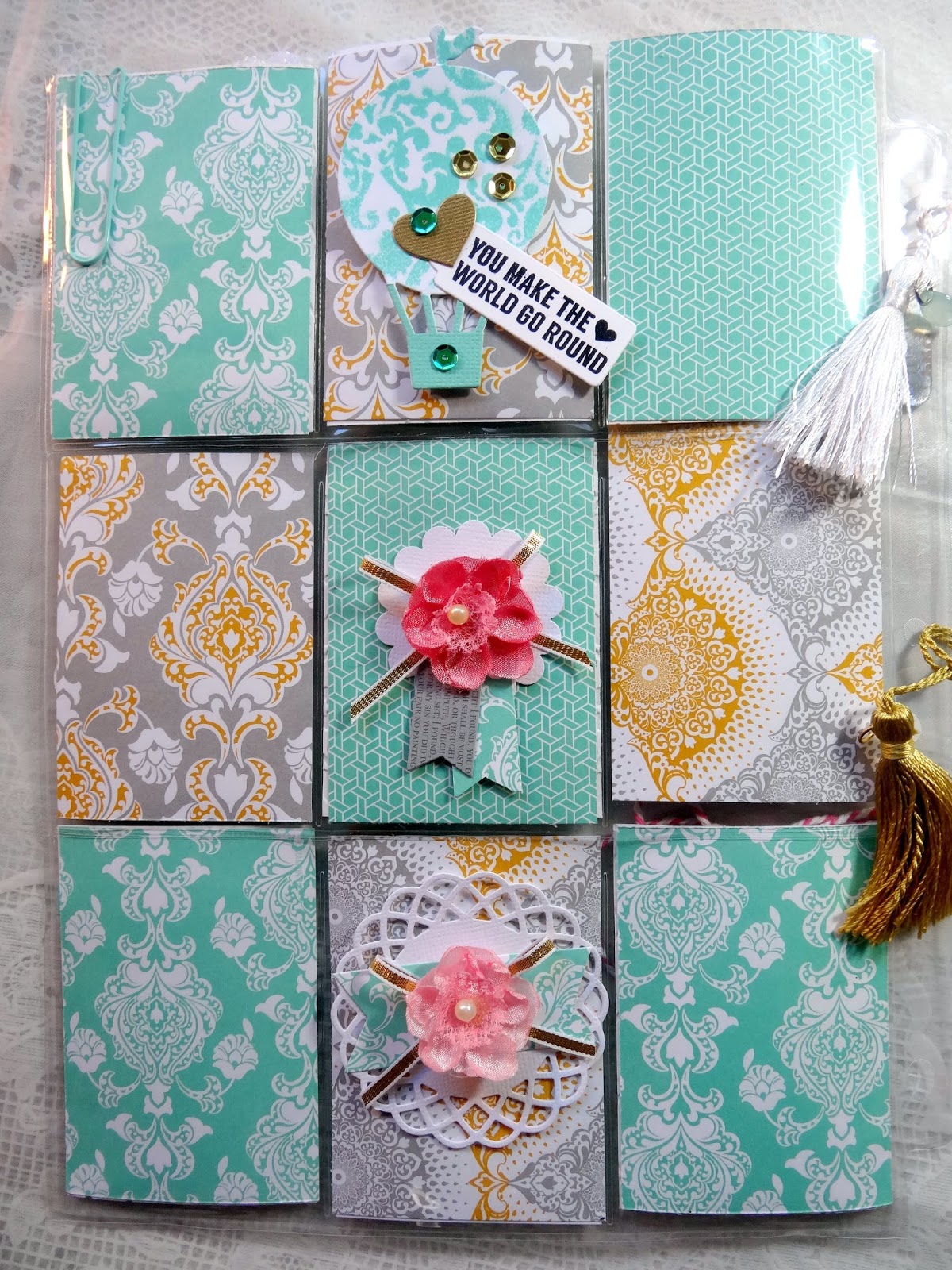
After much deliberation I chose to use Finnabair's Art Recipe July this year: "Rusted and Rustical". You don't have to make the same project or even follow the recipe step by step. What inspired me about this recipe was the rusting. So this is what I came up with (I've highlighted the products that were used on this):


I've been wanting to use my old paint brushes on a project for ages and when I finally came across a cheap mdf artists pallet I knew what I wanted to do. After covering my project with news print paper and Gesso,  I "rusted" up the metal pieces on the brushes as well as the cogs with rusting powder and brown vinegar. I then glued them to the project with a hot glue gun.


I then threw some rusting powder around them on the background and added some Tattered Angels Glimmer Glaze in Indian Summer. I also used Modelling Paste for the flourish and quote, 3D Gel Medium to hold the beads in place and to cover them ready for colouring.


Once the modelling paste was dry I cover it with Ranger Crackle Pain. I stamped the background with a Kaisercraft background stamp and Tim Holtz Distress Ink in Tea Dye and then used a aqua pen to move the ink around. The aqua brush was also used with water colour paint to smudge and blur the flourish. I laid down some old crochet pieces under the brushes before adding the embellishments. Also added some drips of Prima Colour Bloom in "Berry Wine" which happily settled within the crackle paint.


I painted up the embellies and flowers using Gesso, Aquamarine acrylic paint, Heidi Swapp Colour Shine in "Mint" (also used on the background), Prima Colour Bloom in "Deep Teal". I added some aquamarine paint on the rusted cogs. Glimmer Glaze was also dabbed onto the flower petals here and there.

Happily this project really stretched my creative imagination and I'm pleased that I got to use such a variety of media on this piece. I would really appreciate any feedback/advice from any of the Mixed Media Place Design Team on any improvements or tips/tricks to improve my techniques :)  Thanks for looking xx

Jot Magazine Challenge...

While I'm on a roll this weekend (raining!! perfect creating weather), I decided to have a go at the new Mood Board over at Jot Magazine.

Beautiful shades of blue along with white and silver, how could I resist! Not that I use blue a lot, hence why I wanted to have a go at this. Plus the quote really struck a chord :)

"You are our greatest Adventure"

It's a rainy day here so the lighting isn't great I'm sorry. Thank you Lizzy Hill for the lovely silver doily. I've added silver glitter alphas and I die cut the hot air balloon & added silver sequins to the balloon.


The Flair button and Punchinella is from D-lish Scraps and the compass is a Kaisercraft die.


Thanks for calling in again. I've only one more post for this weekend...a mixed media project that really stretched my creativeness, so stay tuned!

Pocket Letter Pals...

As if there isn't enough fun in the paper crafting industry, I've recenlty been introduced to Pocket Letters through the girls at Scrapping Clearly. If you are unfamiliar with this concept check out Pinterest! Anyway I've joined the Pocket Letter Pals Group at Scrapping Clearly where we are given a name from the group to exchange our pocket letters with each month. A theme will be set for each month to give us a guide. I couldn't wait to do my first pocket letter and get it sent off to my very first "pal". The theme this month was a mood board from Heidi Swapp:


We didn't have to use Heidi Swapp products, which I don't have a lot of, so I used the colours as my inspo. The pockets may be small (about an ATC size) it's surprising what you can fit in them. Here is the pocket letter I sent off to my buddy:


I'm a tad obsessed with "gold" at the moment, along with "mint green/aqua", I just love the combination. It's not necessary to do the back of the pocket page, but I decided to add a couple of hand-made embellies anyway. The pocket with the butterfly is the letter that is required, just telling your pal a bit about yourself.


It is such a nice change to get SNAIL MAIL for a change. I really like this concept. Here are a few close ups of the pockets:


A few of the cards are made with some lovely Heidi Swapp "Mint" spray and a stencil. For the one above I added a quote in gold lettering.


I also cut some shiny gold cardstock and run it through the embosser. I also made a little shaker pocket with the Fuse and threw in some seed beads & sequins. The Flair button and camera are separate from the shaker pocket. The little gold leaves and words are also cut from a die.


This is the pocket page wrapped & ready to pop into a standard size DL envelope & post off.


It was a lot of fun putting this pocket letter together. If you'd like to join the group just contact the girls at the Scrapping Clearly Blog (see link above) or on their FB page HERE

TFL xx


Saturday 22 August 2015

My one on one tutorial with Lizzy Hill...

Welcome back fellow crafters! One of the many things that I love about paper crafting is that there is always something new to learn no matter how long you've been in the industry. During my recent stay at Camp Mojo the very talented Lizzy Hill gave me a one-on-one tutorial on a lovely stamping technique - Bokeh. I love how easy this is to achieve and yet it looks very effective. Here is a definition if you have not come across the term before.

  1. In photography, bokeh (Originally /ˈboʊkɛ/, /ˈboʊkeɪ/ BOH-kay — Japanese: [boke]) is the aesthetic quality of the blur produced in the out-of-focus parts of an image produced by a lens. Bokeh has been defined as "the way the lens renders out-of-focus points of light". wikipedia - the free encyclopaedia.
So it happens that you can reproduce this with stamping, similar to the photography technique. Here is the sample that I made (although it was a lot larger than this until I cut it down).


And then I decided to use it on the background of a layout that I created while at the Camp.


I just love this photo of my daughter and her friend taken by Jon Mold in Italy a couple of years ago while they were attending another friend's wedding. I've used this photo before because it is so scrapbook friendly :)  I've used the yellow Bokeh as part of the background and added more circles extending off it with texture paste. I'm going to use the left over piece on a card. I can't wait to use this technique on more of my work and in different colours, so stay tuned.

TFL xx

Thursday 20 August 2015

Tag Trio...


Hello again and welcome back. My feet are finally back on the ground since returning from a four day stint at Camp Mojo. It was so much fun to do a road trip with one of my distant scrapping buddies and to also meet some creative friends for the first time face to face. A huge thank you to Mary (my travel partner), Lizzy (my roomy) and Leanne for putting up with me and for the creative sharing and caring, and for all the laughter. Also a big thank you to the lovely Sherry Mendoza for her amazing organisational skills and providing an opportunity for we Aussie scrappers to be able to enjoy each other's company at Camp Mojo in the beautiful Hunter Valley.

(Gotta love a bit of fun with props!) 

(The Hunter Retreat, Quorrobolong - beautifully peaceful & tranquil)

We had planned this get-together 12 months ago and I can't believe that is has now come and gone. I miss my kindred spirits already. But the other reason for my post today is that I wanted to share with you the tags that I made for my Camp buddies.


It's been ages since I have made tags and for these I used some mixed media on the background but has somehow been mostly covered up with the embellies....oops! I doesn't look like it in this pic but I dyed the white satin seem binding with water colour paint to match the colour theme. The pretty butterflies are cut from a die (very intricate I must say).

Anyway, I hope I have inspired you to create your own tags if you haven't gone down that path yet, and thank you for dropping by. I'll be back soon with some more design team creations xx

Monday 17 August 2015

Scrap Africa #57 Mood Board

Welcome back my creative friends! I want to share with you the amazing Mood Board for the new challenge at SCRAP AFRICA.  This will really lift you out of the winter blues!


I love these colours and coincidentally I recently recieved some paper from Studio Calico "Brighton Pier" collection and when Denise set this challenge for us I had the perfect paper for it....gotta love that!


I really like Orange and Pink together and it so happens that I have some pink and orange confetti in my stash as well, so I laid down some clear gel medium and stuck the confetti down along with some sequins. To break up the colour I added some black. The chippy circle "love" frame is from ScrapFX.


I added some bright green leaves that match the shirt I am wearing in this pic and of course I just had to add a gorgeous mini sequined bow from D-lish Scraps (one of my favourite products from D-lish).


I'd really love to see your interpretation of this mood board, just to get you into the mood for Summer :)  TFL xx

Sunday 2 August 2015

Scrap Africa #56 Challenge

Well hello once again and thank you for dropping by. Today I'm sharing my take on the new challenge at SCRAP AFRICA. Denise has once again come up with a delicious sketch for us to follow:

I couldn't wait to get stuck into this one, but I did get a tad carried away and my page turned out a bit busier than what I initially wanted.


I've used some old paper from Stampin' Up! which happened to be perfect for this layout.  I don't know about anyone else in the Southern Hemisphere but I am definitely sick of winter now. It has been a particularly bitterly cold time this year and I am more than ready for Summer. I took this photo recently on a trip I did with my daughter. I really like the reflection of the winter trees on the water in this pond.


I've used some green 3D paint on the chipboard branches, texture paste on the background as well as a bit of stamping. Thanks for looking and I really hope you are inspired by the sketch. Until next time...

Saturday 1 August 2015

Another FANtastic ARTastic challenge...

Hello everyone on this first day of August! I'm glad you found the time to drop by and check out my inspo for the new challenge over at ARTastic.  This piece of artwork by Kirra Jamison titled "Over the Moon" is one of my favourite challenges because it includes my favourite bird. This time I wanted to have a go at hand drawing and include it in my Art Journal. But first here is the inspirational art work:


Very cute I must say! And here is my art work with a first attempt at a hand-drawn owl:


I layered strips of paper on the background and then laid down some Gesso. I then went to town with my inks, sprays, texture paste, well you name it, I used it! :)  I even managed to use some old crocheted pieces which I sprayed and painted.


I may go back and colour my owl with water colours later on, but I'm not confident enough yet to do it. I used charcoal pencils for drawing and outlined him with Faber-Castell Big Brush pen in black.


I used "Structure" mixed with yellow paint for the moon/sun rays (using a Tim Holtz stencil) and a star stencil. Once again I had a lot of fun getting messy with this project. If you're not sure where to start with this challenge, pop on over to the ARTastic blog and check out all the lovely inspo from my fellow DT members. There will be new inspiration during the month from the other half of the Team as well. I really hope you can join in. Thanks for looking xx